Results for ""
Breast cancer has two early detection strategies: early diagnosis and screening. Early detection initiatives focused on knowledge of early signs and symptoms and timely referral to diagnosis and treatment should be prioritized in low-resource areas with weak health systems, where women in the majority have the late diagnosis. By lowering barriers to care, early diagnostic strategies aim to provide prompt access to cancer therapy.
Some of the symptoms include -
1. Fluid leaking from the nipple in a woman who isn't pregnant or breastfeeding changes in the position of the nipple
2. Changes in the size, shape, or feel of your breast skin changes in the breast like puckering, dimpling, a rash, or redness of the skin.
3. A new lump or thickening in your breast.
Problem Statement
The risk of breast cancer grows with age. It is crucial to be breast aware regardless of age. Breast cancer is the most frequent malignancy in women in the United Kingdom.
The goal is to raise the percentage of breast cancers detection, allowing for more effective treatment and lowering the risk of death from breast cancer. We employ several machine learning algorithms to predict whether a tumor is benign or malignant based on the features presented by the data because early detection of disease is critical for the effective treatment of breast cancer.
Role of Machine Learning
It's difficult for doctors to tell if a tumor is hazardous or not only by looking at x-ray images. Hence a machine learning model based on tumor identification can be quite beneficial.
About the Data Set
1. ID number
2. Diagnosis
3. radius
4. texture
5. perimeter
6. area
7. smoothness
8. compactness
8. concavity
9. concave
10. symmetry
11. fractal dimension
12. Mean, standard error, and "worst" (mean of the three largest values) of these attributes were calculated.
Steps to follow-
1. Finding the null values
2. Finding the outliers
3. Replacing the outliers by mean values.
4. Choosing the best model
5. balancing the data by SMOTE.
6. Splitting the train and test data.
7. Choosing the best model to detect breast cancer.
Exploratory Data Analysis
#Importing the libraries
import matplotlib.pyplot as plt
%matplotlib inline
import pandas as pd
import numpy as np
import seaborn as sns
from sklearn.preprocessing import LabelEncoder
from sklearn.model_selection import train_test_split
from sklearn import metrics
import tensorflow as tf
import warnings
warnings.filterwarnings('always')
warnings.filterwarnings('ignore')
df= pd.read_csv("Breast-Cancer.csv")
df.head()

df.shape
(569,32)
We have 569 rows and 32 columns.
df.drop_duplicates(inplace=True)
df.isna().sum()
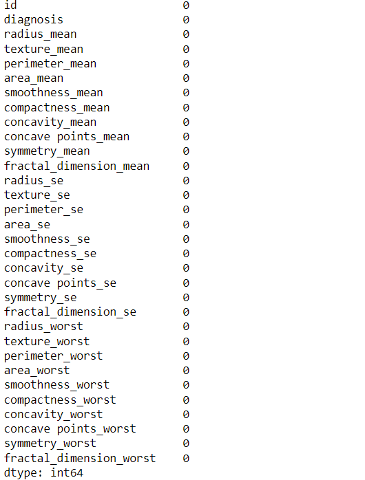
No duplicates and null values are found.
from matplotlib import cm as cm
fig = plt.figure()
ax1 = fig.add_subplot(111)
cmap = cm.get_cmap('jet', 30)
cax = ax1.imshow(df.corr(), interpolation="none", cmap=cmap)
ax1.grid(True)
plt.title('Breast Cancer Attributes Correlation')

fig.colorbar(cax, ticks=[.75,.8,.85,.90,.95,1])
plt.show()
.png)
#create a histogram
import plotly.express as px
fig = px.histogram(df, x='diagnosis')
fig.show()
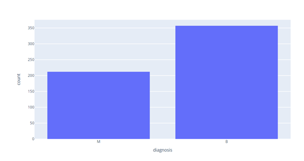
M counts= 200, B counts = 350. Now we will check for outliers in our dataset.
Outliers
We will now check and replace the outliers by using the mean value by using function.
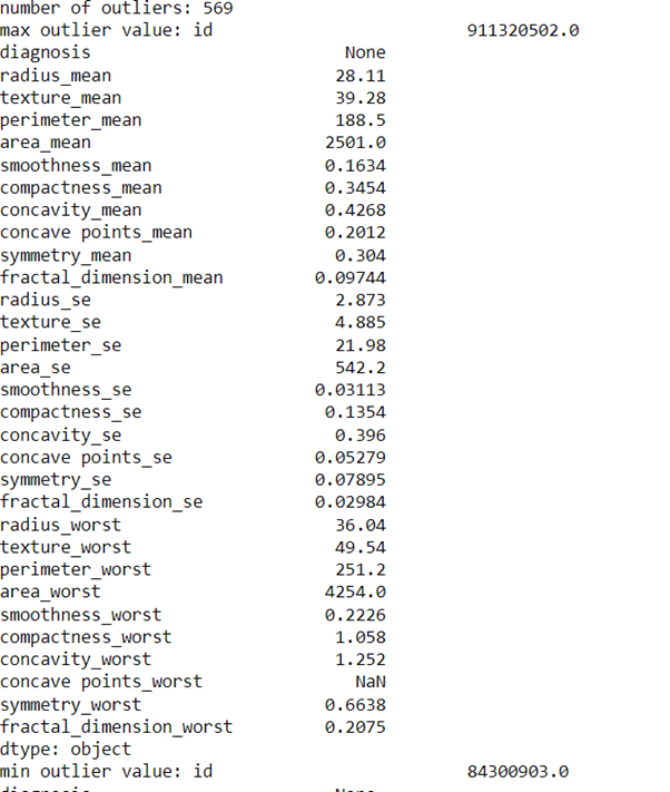
def find_outliers(df1):q1=df1.quantile(0.25)q3=df1.quantile(0.75)IQR=q3-q1outliers = df1[((df1<(q1-1.5*IQR)) | (df1>(q3+1.5*IQR)))]return outliers
outliers = find_outliers(df)
print('number of outliers: '+ str(len(outliers)))
print('max outlier value: '+ str(outliers.max()))
print('min outlier value: '+ str(outliers.min()))
outliers
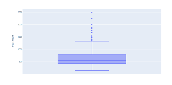
Box plot of area_mean shows outliers.
#create a box plot
fig = px.box(df, y='area_mean')
fig.show()
def impute_outliers_IQR(df1):
    q1=df1.quantile(0.25)
    q3=df1.quantile(0.75)
    IQR=q3-q1
    upper = df1[~(df1>(q3+1.5*IQR))].max()
    lower = df1[~(df1<(q1-1.5*IQR))].min()
    df = np.where(df1 > upper,
       df1.mean(),
       np.where(
           df1 < lower,
           df1.mean(),
           df1
           )
       )
    return df1
upper_limit = df['area_mean'].mean() + 3*df['area_mean'].std()
print(upper_limit)
lower_limit = df['area_mean'].mean() - 3*df['area_mean'].std()
print(lower_limit)
>>>
1710.6314912356438
    -400.8532838542724
df['area_mean'] = np.where(df['area_mean'] > upper_limit,
   upper_limit,
   np.where(
       df['area_mean'] < lower_limit,
       lower_limit,
       df['area_mean']
   )
)
#create a box plot
fig = px.box(df, y='area_mean')
fig.show()
.png)
upper_limit = df['area_worst'].mean() + 3*df['area_worst'].std()
print(upper_limit)
lower_limit = df['area_worst'].mean() - 3*df['area_worst'].std()
print(lower_limit)
df['area_worst'] = np.where(df['area_worst'] > upper_limit,
   upper_limit,
   np.where(
       df['area_worst'] < lower_limit,
       lower_limit,
       df['area_worst']
   )
)
#create a box plot
fig = px.box(df, y='area_worst')
fig.show()
.png)
#create a box plot
fig = px.box(df, y='area_se')
fig.show()
.png)
upper_limit = df['area_se'].mean() + 3*df['area_se'].std()
print(upper_limit)
lower_limit = df['area_se'].mean() - 3*df['area_se'].std()
print(lower_limit)
df['area_se'] = np.where(df['area_se'] > upper_limit,
   upper_limit,
   np.where(
       df['area_se'] < lower_limit,
       lower_limit,
       df['area_se']
   )
)
#create a box plot
fig = px.box(df, y='area_se')
fig.show()
.png)
df.describe()[['area_mean','area_worst','area_se']]
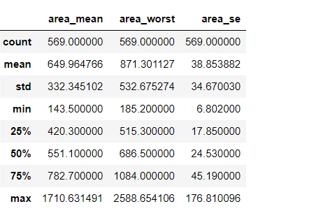
From our data we can see that mean value is now fine as compared to earliest.
Transforming Categorical to Numerical Values
We will use Label encoder for converting Categorical values into numerical values.
#categorical features
categorical = df.select_dtypes(include =[np.object])
print("Categorical Features in Train Set:",categorical.shape[1])
#numerical features
numerical= df.select_dtypes(include =[np.float64,np.int64])
print("Numerical Features in Train Set:",numerical.shape[1])

# Labelencoding
le = LabelEncoder()
var_mod = df.select_dtypes(include='object').columns
for i in var_mod:
    df[i] = le.fit_transform(df[i])
We check for Correlation and can see almost all features are positively correlated with target.
Correlations
correlations = df.corrwith(df['diagnosis'])
correlations = correlations[correlations!=1]
correlations.plot.bar(
        figsize = (18, 10),
        fontsize = 15,
        color = '#ec838a',
        rot = 45, grid = True)
plt.title('Correlation with Upvotes \n',
horizontalalignment="center",
fontstyle = "normal",
fontsize = "22",
fontfamily = "sans-serif")
.png)
Model Check
We will check for best model by using pycaret and sort it by accuracy score.
# init setup
from pycaret.classification import *
s = setup(df, target = 'diagnosis')
best_model = compare_models(sort='Accuracy')
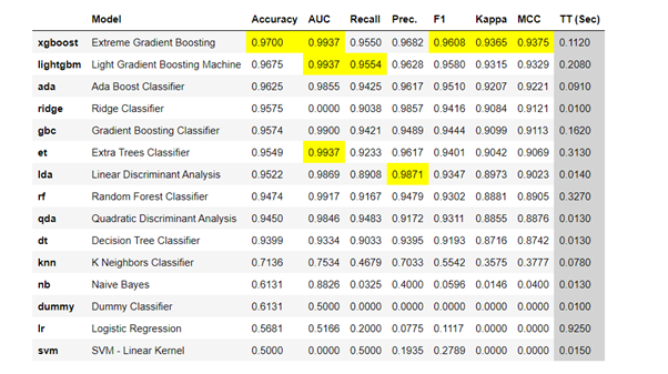
xgBoost Classifier shows accuracy of 0.9700.
# tune best model
tuned_best_model = tune_model(best_model)


X= df.drop(columns =['diagnosis'], axis=1)
y= df['diagnosis']

from imblearn.over_sampling import SMOTE
sm = SMOTE(random_state=0)
X_resampled, y_resampled = sm.fit_resample(X, y)
y_resampled.value_counts()
X_train, X_valid, y_train, y_valid = train_test_split(X_resampled, y_resampled, test_size = 0.2, random_state=42)
from xgboost import XGBClassifier
from sklearn import metrics
model= xgbc ()
model = a.fit(X_train, y_train)
y_pred = model.predict(X_valid)
print("Accuracy:",metrics.accuracy_score(y_valid, y_pred))
>>>
Accuracy: 0.965034965034965
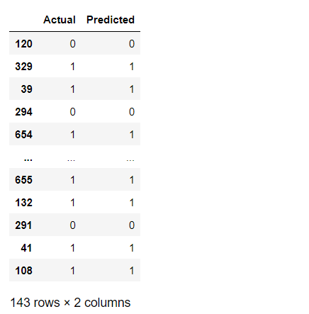
We will now plot a graph between actual and predicted values.
df3 = pd.DataFrame({'Actual': y_valid, 'Predicted': y_pred})

df3
df9 = df3.head(25)
df9.plot(kind='bar',figsize=(16,10))
plt.grid(which='major', linestyle='-', linewidth='0.5', color='green')
plt.grid(which='minor', linestyle=':', linewidth='0.5', color='black')
plt.show()
.png)
Conclusion
XgBoost Classifier was the best model, having an accuracy of 0.96. Some wrong predictions were too calculated, but our model was successful in the correct prediction of malignant and benign features based on the dataset.
Key Points
1. knowledge of Breast Cancer.
2. Finding the best model by pycaret.
3. Removing the outliers.
Sources of Article
UCI , Kaggle


